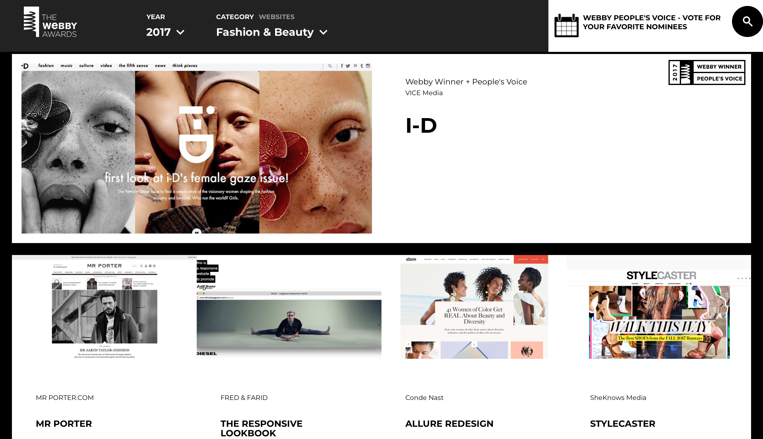
What is i-D Magazine, and why did they win a Webby Award?
i-D Magazine has been around since the 1980’s. The primary focus of this magazine is on fashion, art, culture, music, photography, and youth culture. the origins of i-D began as a fanzine dedicated to the street styles during the punk-era in London during the 80’s. Their mission was to abide by originality, and to not imitate the others. The magazine is currently owned by VICE media. Vice media is known on creating content for print, video, and television. They often cover topics, such as fashion, music, travel etc. In 2017, i-D’s website was nominated for a Webby Award. Webby awards are given out to esteemed creators of new media through a vast variety of subjects, focusing on special achievements, web design, online film & video, advertisement & media. mobile sites & apps, social networking, and podcasts & digital audio. i-D’s website won under the fashion & beauty category for web design. I’ll be going through i-D’s site and see if their website design and concepts was enough for them to win an Webby award. Through out this review, I will be looking at their design choices, and compare it to i-D’s contemporaries. Does the homepage provide a solid groundwork with accessing their whole website? Are search bars and social media buttons clearly shown? How articles associated with each of the publications are presented. Does i-D conform to the standards provided by the American Disabilities Act? Do the messages i-D send reach the intended audience? How does i-D’s overall design influence my decisions on how my website should look?
*info taken from the 'about us page of i-D Magazine, https://bit.ly/2uv4K9z, Company overview of Vice Media, LLC, https://bloom.bg/2E24Qox and The Webby Awards webpage, https://bit.ly/2hRJSR9.
The aesthetic of the homepage
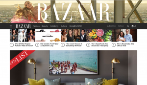
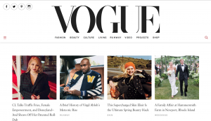
Like any fashion or art magazine,these magazines dedicate their webspace to their aesthetic. Depending on who you visit, whether it is Harper’s Bazaar, or Vogue. There are going to be a lot of images with captions in your face during the homepage. By clicking these images, they most likely take you to an article associated with them. This can be overwhelming to any visitor. Depending on the type of person you are, you might already know what you are looking for. If you are a regular visitor such as me. I am unsure on what to look at first.
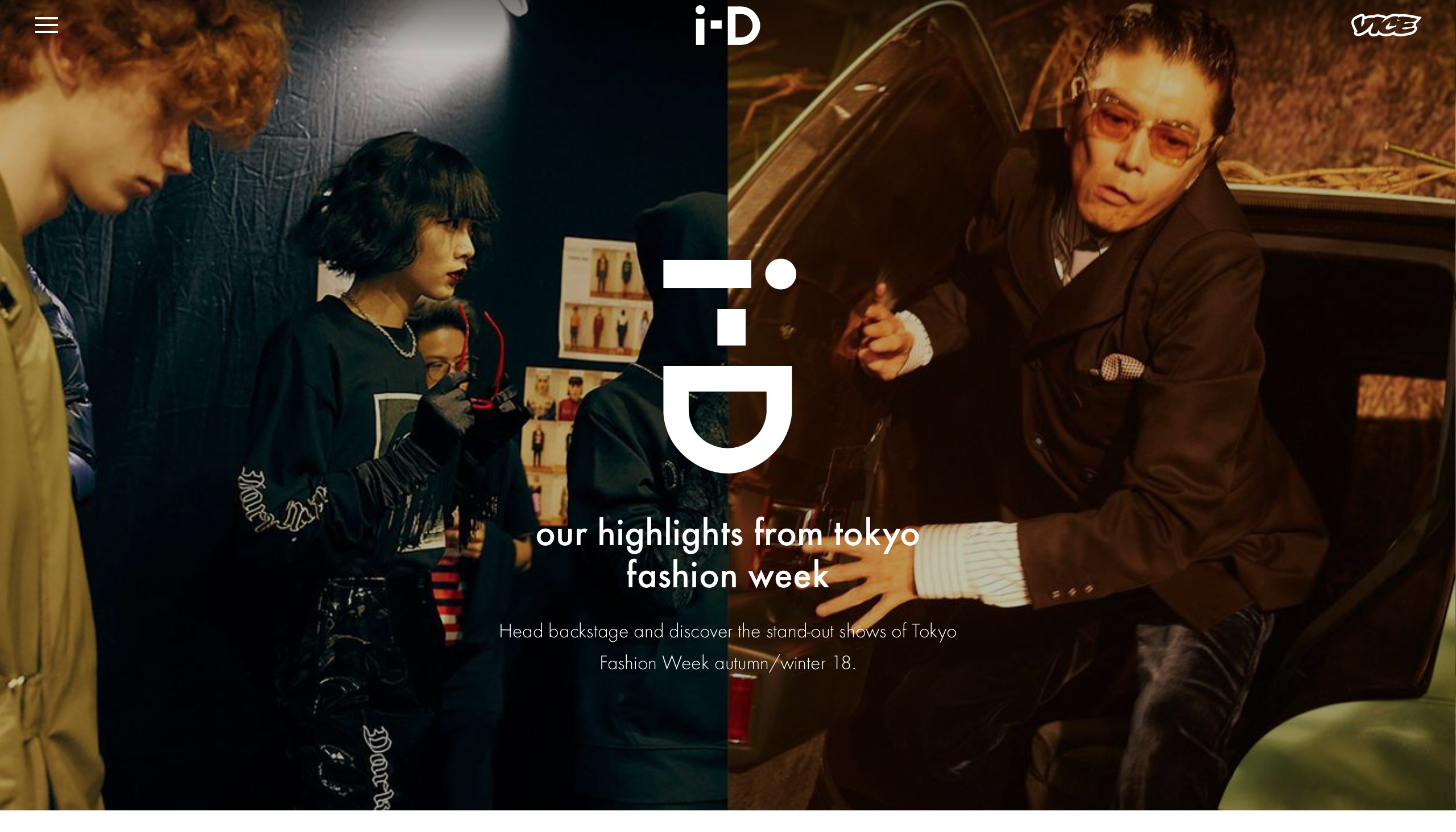
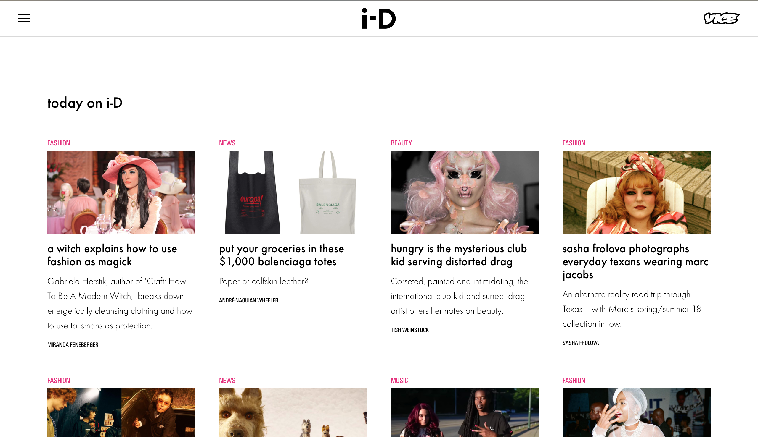
What is nice about i-D’s design choices of their homepage is that it has a very simplistic approach. The top page has a focus on one topic. At the time of writing this review, they have a highlight’s article of Fashion Week in Tokyo. Upon scrolling down the homepage, they have an”today on i-D” section”. These articles range in a variety of topics, and they are spread out evenly. The spaciousness provided does not overwhelm the eye, which aids with navigation.
Searching the site, as well as direct links to their social media pages
Other design choices employed by Harper’s Bazaar, and Vogue have included social media links and a search bar. These links, and search tools are explicitly seen on the homepage. With Harper’s Bazaar, they have an option in the navigation bar titled “Follow” by mousing over it you see all the social media platforms they are on. Right next to it, shows a magnifying glass, which is common symbol to search for something within their site. When you click on the magnifying glass, a overlay appears on the page that shows a huge search bar. On Vogue’s site, the social media icons are planted on the top left of the page, then they have a magnifying glass that when clicked prompts a search box to appear over the Vogue logo header. This helps with their audience be able to search for specific articles. It will also aid to them taking them directly their social media outlets.


i-D’s page does not explicitly show a search bar or their social media buttons. To access their search bar you have to click the three little bars that shows a drop down menu. Their social media buttons are all the way to the bottom of their site. Which can hurt their audience especially the young adults, in who they aim for their intended audience. Young Adults are likely to be on many social media platforms, and they would probably like to follow i-D’s social media pages.
How do their articles look?
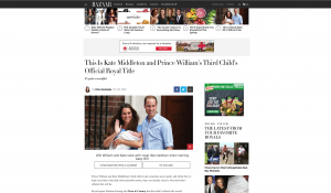
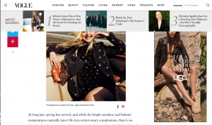
Another thing worth mentioning is how these magazine publications flesh out their articles. How does it look to the eye of the reader? Starting with Harper’s Bazaar, with their article of Kate Middleton and Prince William newborns’s royal title. The page is rather cluttered with links to other articles and advertisements. Vogue’s article about skincare is very cluttered as well. One particular aspect I do not like about Vogue’s setup is that if you scroll up this bar drops down constantly with links to other articles. This feature is so distracting cause the bar drew my eye from the paragraph I was reading. If you have an ad blocker extension in your browser that my help eye strain, because the advertisements can be flashy (note: it is expected because these are fashion publications). It is not a one hundred percent fix but at least you can focus on the article you intend to read.
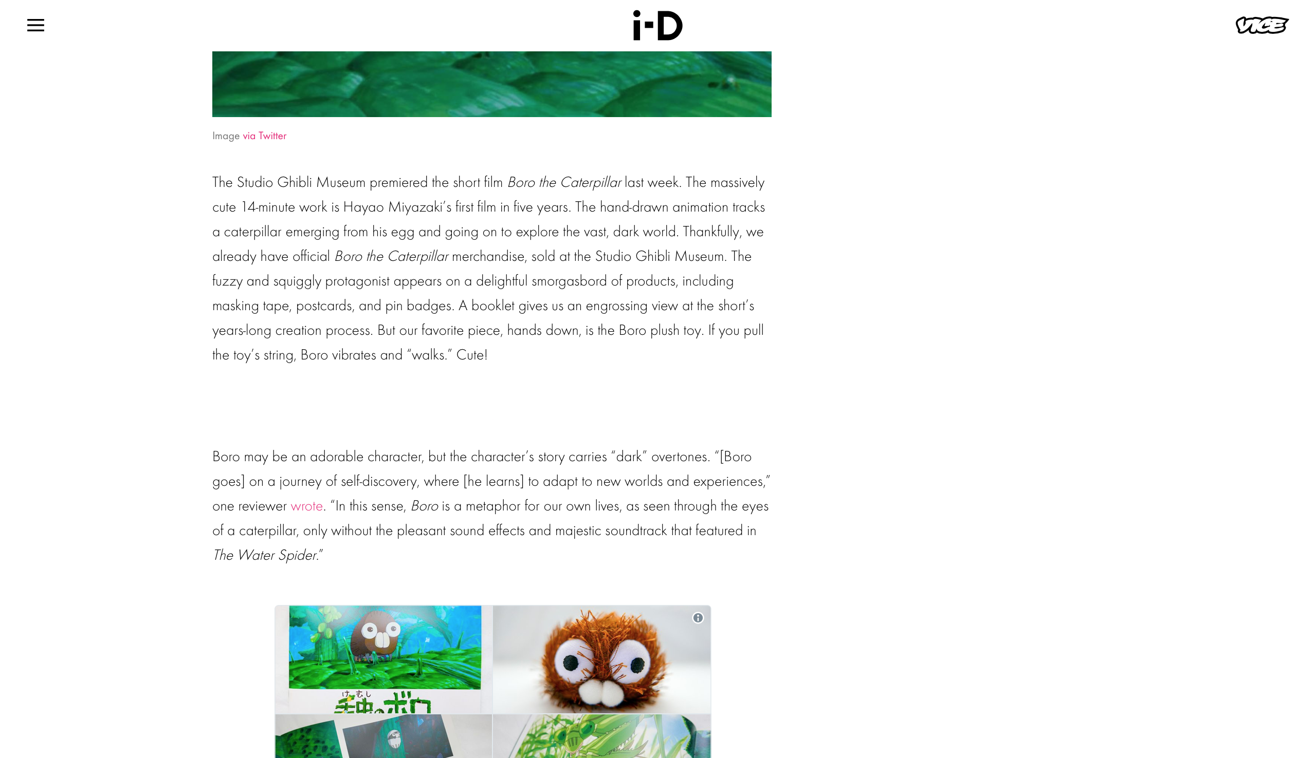
A typical article on i-D’s site is surprisingly quaint. There are advertisements, but just one large one in the heading, then a standard square sized one on the right hand side. My only gripe is that these advertisements have those flashy elements from the sites previously mentioned. Which can easily be turned off with an ad blocker. But overall the article about Studio Ghibli’s short film Boro The caterpillar’s merchandise has arrived was readable. It was clear and organized and only had elements of the article. No side links to other items in between the paragraph. I applaud i-D’s choice on this as it provides a clear and concise reading experience. Another plus for me was that instead of links to other articles were not on the side, nor popping in and out. It just continued with another article pulled from the daily articles on the homepage. It felt like I was reading a never ending newspaper.
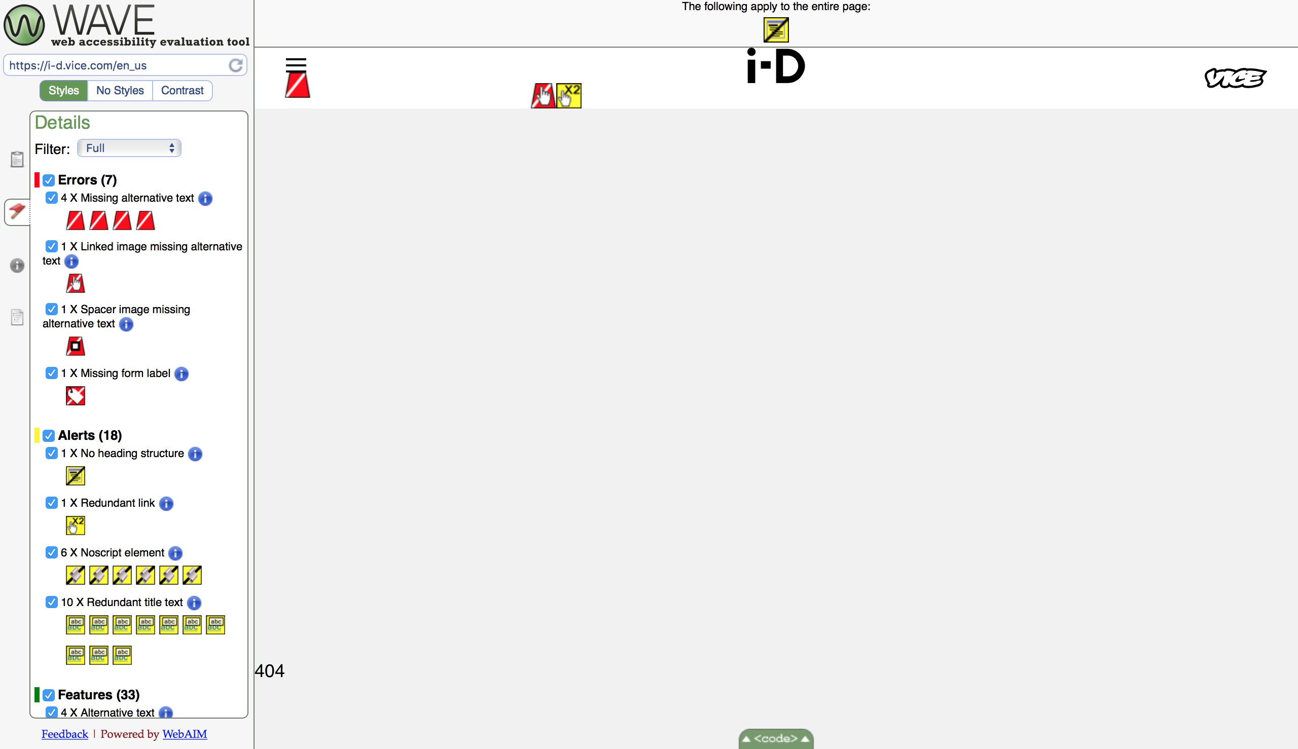
Is i-D’s website ADA compliant?
Although i-D’s website has a lot of graphics and images on their site. There are some aspects of their site that make it not ADA compliant. I can imagine for a site of this caliber to not catch everything, but there are some important features not included. First, is their navigation menu, where you click the three lines and the drop down menu appears. It is missing alternative text, which is a brief descriptor screen reader programs read out from the HTML code. Second there is no heading structure. Someone accessing their site might struggle, because there is nothing available for assistive technologies to scan through. Having a heading structure is important because it can provide a clear outline about the site you are visiting. A website like i-D needs to provide this so that the visitor is able to understand what website they are on. Third and foremost, is that the big main image that appears on the homepage of i-D is missing alternative text too. Which is a big deal if the image links to the important article i-D wants you to visit.
Does the messages send i-D reach their audience?
Overall I think i-D does a great job with reaching their audience. Audience in my age range like lets say 18-25 years old will be interested in the content they share. But that is aided by the fact that Vice Media is their parent company. I think that Vice Media does a great job integrating its other platforms within i-D as well to create a positive visitor experience. i-D magazine covers a variety of subjects. I do like to read their articles about culture, and music especially. Their analyses on these topics gather deep thought. One recent article was an interesting read was about Tomb Raider’s main protagonist, Lara Croft. They inquired if she is a feminist hero, or another male fantasy. The article dissects her history within video games to the recently released action movie based off the Tomb Raider series.
- Here is a video the article features which is a scene from when Angelina Jolie played Lara Croft
Overall thoughts
In all honesty, I know why i-D won that Webby Award. It has a very modern look, it is clearly organized and easily navigable. Despite the few non-ADA quips they have on their site. Not to mention the large variety of articles they have are very impactful and different. i-D magazine’s content has that underground look. Their motto of adhering to originality is admirable compared to what Harper’s Bazaar, and Vogue put out. I hope to take a few cues from i-D’s web design and implement it to my site. My goal for my site is to have a decent visiting experience. I do not want to clutter it, the last thing I want is my audience to get overwhelmed with how my content is presented. Having a clear, and organized website will hopefully keep them on my site, and visit more often.
Further Reading
WAVE (Web Accessibility Evaluation Tool)
Webby Awards website
Vice Media’s website
i-D Magazine’s website
Harper’s Bazaar’s website
Vogue’s website