The scholarly archive of ReEnvisioning Japan has two different sites. One that is the original website, and another that looks to be a refreshed more modern looking version of the project. I will often go back and forth between both sites to see if they are properly designed and meets the criteria of what their project entails. I will be looking at differences of layouts, their uses of responsive design, and more. Glancing around to see if their website adhere’s to their mission for visitors accessing the site. I find the newer website they designed more user friendly and better fleshed out compared to the original site.
About
This website is a ongoing digital archive of artifacts from Japan during the 20th century. They are taking physical artifacts from this era of Japan an digitizing it to allow the world to access what is available instead of trying to see it in person. This digital humanities project is open to anyone interested in learning about Japan’s culture. Of this collection, the people working on this project have stated that they have digitized about 75% of their collection and have been meticulously cataloged for organizational purposes. The mission statement of this website is after the whole archive is completed, the authors hope that they are able to open it to a community of contributors. By contributing, they can open a pathway of new users of providing new perspectives on familiar questions. The authors had stated that you are free to use the content for their site as long as you cite them for credit purposes.
This website has many different forms of media that came from that era in Japan.
- Edification and Information
- Leisure and Entertainment
- Moving images
- Postcards
- Tourism and Travel
*taken from both the original site and the updated site http://bit.ly/2oBh42F

http://bit.ly/2F4Uzx6
Introduction, the header
Upon first signing onto the website ReEnvisioning Japan. The first thing I notice is the heading of the logo, subheading, the different topics to click through , and a search bar I first notice the logo of the website, with reennvisioning written in cursive with a red dot superimposed on the ‘re’ to symbolize the Japanese flag. With the word Japan in a serif font that is the bigger in size that takes up most of the logo. That is a nice touch to the the logo to keep with the Japanese theme. Along with a subheading of a brief description of what this website is about. Which is “Japan as a destination in 20th century visual and material culture”.

When we view websites, we typically read top to bottom. So I find this very nicely organized to the eye. It is also very easily maneuverable. Near the search bar there is a button to click that takes you to their new site. Upon accessing their new homepage for the site, it is vastly different than the first version. At first glance, they moved the additional navigation options into a gray bar with a smaller logo on the upper left. The gray bar looks really awkward and the color does not fit the scheme, I would have stuck to the pink colors used to keep continuity. They also have the same logo as before with the subheading under it, but there is a strangely placed pink bar that is behind the subheading. This bar’s gradient fades in heavily when it reaches to the right of the page, the pink subtly fades out into the read more section and a Facebook feed.

It is also important to note the difference of navigational options between both sites. The original site’s links to different pages have very specific content for whatever the person is looking for, like ‘Leisure & Entertainment’ etc. Whereas the second site has condensed the options available into the sub-menus of the selected topics. I much rather prefer that moreover than the original version. The information provided is very elaborate and they all deserve to be expanded on the consequent pages.
How is the info presented between both sites?
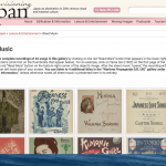
Focusing on their archive of Japanese ‘Sheet Music’. Both sites provide a very in-depth catalog of the topic. But I find the original site rather confusing. There is a brief description prompting a read more button on select items. They say to click on the thumbnails and there should be a button that appears on the lower right. Clicking on these thumbnails, that button rarely appears unfortunately.
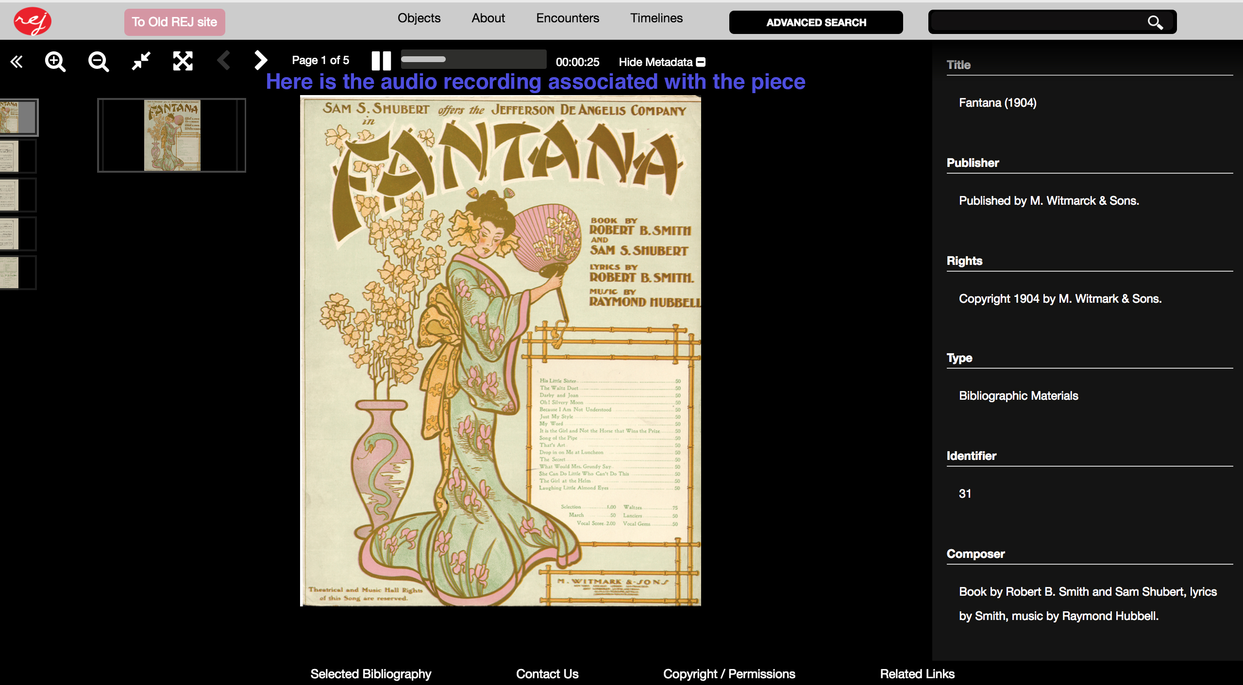
Next is to look at the newer version of the ‘Sheet Music’ page on their modern site, and how it is displayed. The first thing we see, which is a nice touch is a advanced search’ function in which you can sort through associated topics. The original site lacks this feature, that does not help especially if someone is searching for a specific piece. The visitor would have to file through the numerous pages to locate it. The spectator can just type the name and be brought to it within seconds. Another welcoming addition, is instead of directions on how to access the content, the newer site offers insight of what kind of music that you will be subjected to. The authors also discuss that a handful of pieces presented were recorded under the direction of Dr. Phillip C. Carli. By clicking on the piece depending on whether it is available or not, there will be a audio play head on the top of the site. These directions are more explicitly stated by the authors thankfully.
As an example, I clicked on Fantana (1904), to show what this feature looks like.
The viewer they chose for the new website is way better quality than the original site. The original site only just shows image in full size when you click on the thumbnail and nothing else. Another neat feature provided with the new site is the additional pages you can view as well. Not just the covers of the associated sheet music. Tenfold, this helps the user experience a lot, because you are getting the whole piece provided, not just a cover and thumbnail.
Is this content downloadable?
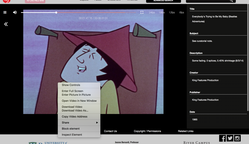
With the content available on ReEnvisioning Japan, users and visitors might want to download a few things to include in their own projects. But is all the content presented downloadable. The answer is no but it depends on whether you use the original or newer site. The original video site does have video but you cannot download them usually by right clicking on the video itself.They host their videos through the JWPlayer service. Which is a proprietary platform that does often not allow video downloads, depending on permissions with the owner.
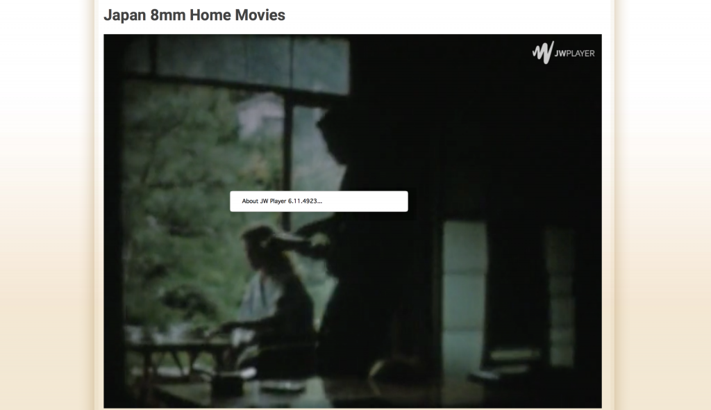
On the other hand the newer site actually offers downloading videos for whatever reason that you would need to. Because the videos look like they use a simple common html interface for video hosting. That can be super helpful for doing a presentation on Japanese film, because you can embed the video in your powerpoint or prezi.
Responsive Design
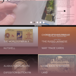
Responsive Design is important to web-design. Responsive design aids in rendering websites to fit on any size screen no matter what device you are using, like a PC, or an iPhone. This technique, is important especially if you are accessing sites on your mobile device. Think about accessing a site on CNN on your computer, and how everything is expanded out and broadly detailed. Imagine accessing that full site on your phone, you would probably be swiping harshly to get to what or where you want to see. Designers for CNN most likely expect people to visit their site on their mobile device, so they create a more user friendly experience condensing it down enough for you to read the articles and hopefully do minimal swiping. With ReEnvisioning Japan in mind, I tested these sites out on my phone to see if they have those elements. The original site does not have a ‘mobile’ version as compared to the newer site. When first loading the site you see it in all it’s fullness. That adds difficulty when viewing it on your phone. You have to zoom in and hope you tap in the exact spot to get to a page you want to see.
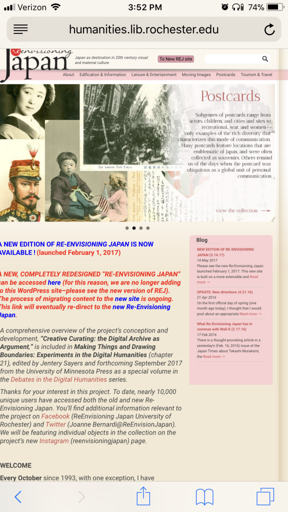
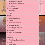
Next is visiting the new site using a mobile device. I noticed a immense difference. which assisted in the positive overall experience. The website was condensed so nicely, that it is was easily navigable. By tapping the menu button, a drop down box appears with all the options available to go to on what you are wanting to view.
Accessibility
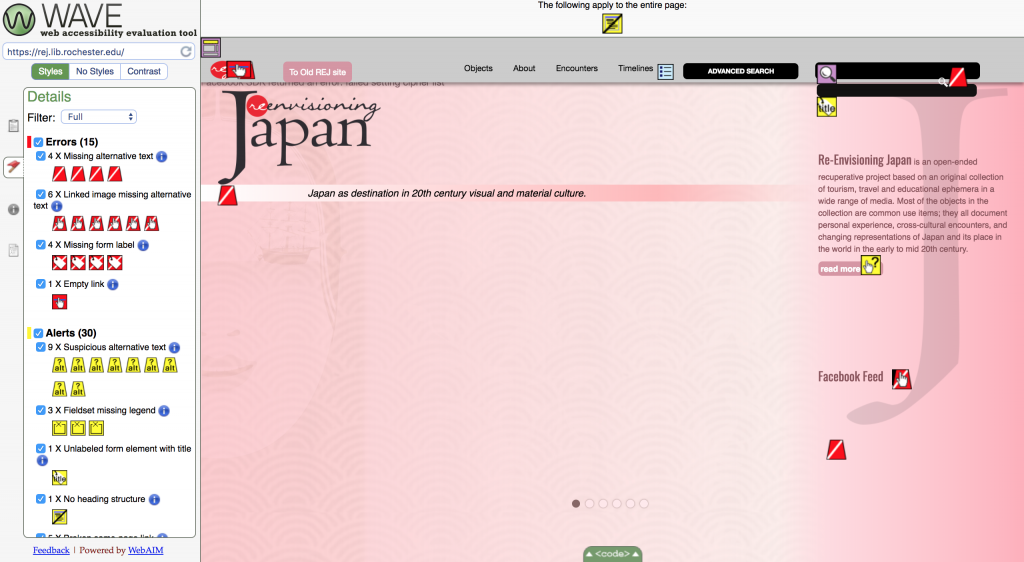
What is important to accessing any website, is that no matter who the person accessing the site, they are able to access it without any issues. People who have disabilities should be able to view this site without struggle, as per ordinance with Americans with Disabilities Act. There are web tools available for designers to see if the website they are creating are ADA compliant. I am using WAVE (Web Accessibility Evaluation Tool), and will check to see what both websites available are ADA compliant. The homepage of the original ReEnvisioning Japan does have some errors, like missing information for headings, and alternative text. I think the authors put in heading tags for spacing purposes, but there are other tags they could use like line breaks, or start new paragraphs. The missing text for headings can confuse screen reading software, because it is looking for as much of descriptive code as possible. With that info missing, the reader could tell the person that that info is missing… moving on to the next part. Another item the website is missing is alternative text. Alternative text are little descriptions that are coded in items like images. Screen reading software will read out the alternative text, and helps describe the image presented to the person visiting the site.
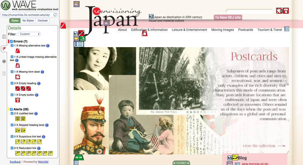
Believe it or not, the new ReEnvisioning Japan site has more errors presented than the original site. The site does not have any heading errors but mostly missing alternative text.
Final Remarks
Overall I believe that ReEnvisioning Japan’s older and newer sites have many pros and cons. When accessing the archival content, the newer site provides a nicer experience. I think that it has a more modern feel that anyone can access. The older site has the information but it is not presented as accurately as the other. Aside from the minimal amount of errors for ADA compliancy. The people visiting these sites should not a too difficult time navigating around. The websites serve their purposes of informing their visitors about 20th century Japan. Although not a complete archive, I am anxious to visiting the site in a few months from now to see if any new content was added in the meantime.
Further Reading
The original ReEnvisioning Japan site
The newer ReEnvisioning Japan site
WAVE Web Accessibility Tool

